Your cart is currently empty!
Combining Illustrator and Photoshop tutorials – textures
[av_textblock size=” font_color=” color=”]
Combining Illustrator and Photoshop tutorials:
Using texture to improve vector illustration
The advantage of using both Illustrator and Photoshop in illustration is endless. The possibilities are enormous and the learning unlimited. Recently I’ve learned several new techniques and tips and enjoying the benefits in my work. I am inclined to take tutorials and pick them apart for the bits that serve me but try to follow through everything I have not tried before. I did stick pretty closely to the instructions in this one though. I am an ever-keen learner and I hope this tutorial helps you too.
If you are interested in combining Illustrator and Photoshop tutorials, the one I refer to here is Matt Kaufenberg’s Character Illustration: From Concept to Final Artwork. If you use this link and sign up to Skillshare for a free month, I get another free month too! Free Month on Skillshare!
[/av_textblock]
[av_two_fifth first]
[av_image src=’http://kayleenwest.com.au/portfolio/wp-content/uploads/spce-pitate-rabbit-illustration-WIP02-450×430.jpg’ attachment=’5914′ attachment_size=’featured’ align=’center’ animation=’pop-up’ styling=” hover=” link=’lightbox’ target=” caption=” font_size=” appearance=” overlay_opacity=’0.4′ overlay_color=’#000000′ overlay_text_color=’#ffffff’][/av_image]
[/av_two_fifth]
[av_three_fifth]
[av_textblock size=” font_color=” color=”]
Step 1: Initial Character Sketch
Searching on line for combining Illustrator and Photoshop tutorials I discovered one on character design using Photoshop and Illustrator. Tutorial sample illustrations are often what attracts me to any to tutorial all or lesson and I was drawn to the textures in his. I wanted to learn more about textures by combining Adobe Illustrator in Photoshop. I have many illustrations in sketch stage waiting to be developed further and so I took this opportunity to pull my pirate bunny out of my archives and finish it in colour.
It was a lovely sepia sketch, but it was perfect for this exercise. I really had the character designed and was ready to further exploration. The lesson wasn’t so much a tutorial in character design, but still handy to see how that illustrator used textures. There are so many variations of techniques and it’s fun learning different ones for yourself.
[/av_textblock]
[/av_three_fifth]
[av_hr class=’default’ height=’50’ shadow=’no-shadow’ position=’center’ custom_border=’av-border-thin’ custom_width=’50px’ custom_border_color=” custom_margin_top=’30px’ custom_margin_bottom=’30px’ icon_select=’yes’ custom_icon_color=” icon=’ue808′]
[av_two_fifth first]
[av_image src=’http://kayleenwest.com.au/portfolio/wp-content/uploads/2015-03-09_Space-Pirate-Bunny_02_outline-01-450×430.jpg’ attachment=’5909′ attachment_size=’featured’ align=’center’ animation=’no-animation’ styling=” hover=” link=’lightbox’ target=” caption=” font_size=” appearance=” overlay_opacity=’0.4′ overlay_color=’#000000′ overlay_text_color=’#ffffff’][/av_image]
[/av_two_fifth]
[av_three_fifth]
[av_textblock size=” font_color=” color=”]
Step 2: Drafting shapes in Illustrator
Using the pen tool in Adobe Illustrator I traced over the main shapes of my design not what worrying too much about colour. I first imported my image into Illustrator and set the layer as a template by right clicking the layer. By doing this the layer is automatically locked and the opacity is reduced to 50%. You can use any colour line you like. Whatever it is easiest to you to see over the base template layer is recommended.
[/av_textblock]
[/av_three_fifth]
[av_two_fifth first]
[av_image src=’http://kayleenwest.com.au/portfolio/wp-content/uploads/2015-03-09_Space-Pirate-Bunny_03_block-in-01-450×430.jpg’ attachment=’5910′ attachment_size=’featured’ align=’center’ animation=’no-animation’ styling=” hover=” link=’lightbox’ target=” caption=” font_size=” appearance=” overlay_opacity=’0.4′ overlay_color=’#000000′ overlay_text_color=’#ffffff’][/av_image]
[/av_two_fifth]
[av_three_fifth]
[av_textblock size=” font_color=” color=”]
Step 3: Block In Shapes
I then began to play with limited colours and fill in each of the shapes. At this stage it doesn’t matter what colours you use – approximate. This is the blocking in stage in Illustrator, not fussing too much over colour.
[/av_textblock]
[/av_three_fifth]
[av_two_fifth first]
[av_image src=’http://kayleenwest.com.au/portfolio/wp-content/uploads/2015-03-09_Space-Pirate-Bunny02_PS-colouing-450×430.jpg’ attachment=’5911′ attachment_size=’featured’ align=’center’ animation=’no-animation’ styling=” hover=” link=’lightbox’ target=” caption=” font_size=” appearance=” overlay_opacity=’0.4′ overlay_color=’#000000′ overlay_text_color=’#ffffff’][/av_image]
[/av_two_fifth]
[av_three_fifth]
[av_textblock size=” font_color=” color=”]
Step 4: Colour
Next I decided on the colour palette. As I knew I would be adding textures and manipulating layers in Photoshop, I kept the colour palette to a bare minimum. I picked colours that I’m highly attracted to when combine. You probably noticed that I used to feel a lot. This is because it’s a favourite colour of mine.
[/av_textblock]
[/av_three_fifth]
[av_two_fifth first]
[av_image src=’http://kayleenwest.com.au/portfolio/wp-content/uploads/2015-03-09_Space-Pirate-Bunny03_PS-brushes-450×430.jpg’ attachment=’5912′ attachment_size=’featured’ align=’center’ animation=’no-animation’ styling=” hover=” link=’lightbox’ target=” caption=” font_size=” appearance=” overlay_opacity=’0.4′ overlay_color=’#000000′ overlay_text_color=’#ffffff’][/av_image]
[/av_two_fifth]
[av_three_fifth]
[av_textblock size=” font_color=” color=”]
Step 5: Texture Brushes in Photoshop
Transferring shapes separately into Photoshop I began to work the texture and render the image using brushes. To do this successfully you have to turn off the transparency on the layer, or you end up painting over the shape and onto the surrounding area. With a transparent layer locked you can go to town on that show and not cross over the edge.
I didn’t like the initial brush I chose so I ended up repainting with a few before I discovered one I liked. I used brushes I already had installed. This was a dry brush that looked a lot like pastel.
[/av_textblock]
[/av_three_fifth]
[av_two_fifth first]
[av_image src=’http://kayleenwest.com.au/portfolio/wp-content/uploads/2015-03-09_Space-Pirate-Bunny051-450×430.jpg’ attachment=’5913′ attachment_size=’featured’ align=’center’ animation=’no-animation’ styling=” hover=” link=’lightbox’ target=” caption=” font_size=” appearance=” overlay_opacity=’0.4′ overlay_color=’#000000′ overlay_text_color=’#ffffff’][/av_image]
[/av_two_fifth]
[av_three_fifth]
[av_textblock size=” font_color=” color=”]
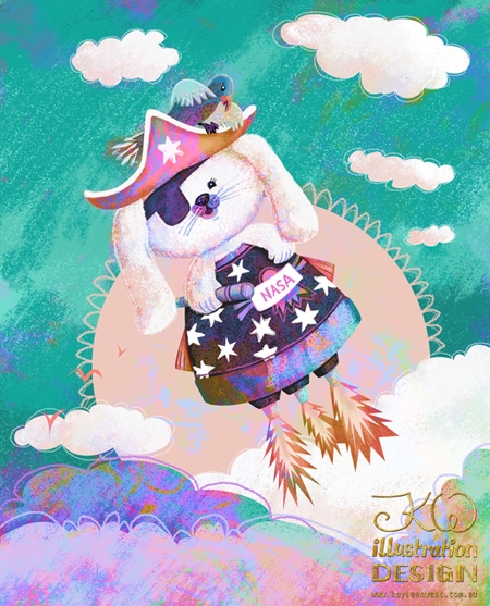
Step 6: Texture & Blending Layers
Finally, I added the texture layers and tested blending modes. I also added a layer of hand painted painted the scribbles and details. I went for a painterly look which is something I like in my work. I like to have the evidence of hand work even when working digitally.
Click image to see the final in the lightbox!
[/av_textblock]
[/av_three_fifth]
[av_two_fifth first]
[av_image src=’http://kayleenwest.com.au/portfolio/wp-content/uploads/2015-03-09_Space-Pirate-Bunny_final-450×430.jpg’ attachment=’5915′ attachment_size=’featured’ align=’center’ animation=’no-animation’ styling=” hover=” link=’lightbox’ target=” caption=” font_size=” appearance=” overlay_opacity=’0.4′ overlay_color=’#000000′ overlay_text_color=’#ffffff’][/av_image]
[/av_two_fifth][av_three_fifth]
[av_textblock size=” font_color=” color=”]
What else I learned…and mistakes I made!
It was a lot of fun working this way. I didn’t know about turning off the transparent pixels which was such a bonus! In the past I had been loading the shapes or selecting with the magic wand and saving the selections. Every time I learn a new thing in Adobe it saves me so much time! Also learning the shortcut key: Alt + Delete to change the colours was something new. Before I was changing colours the hard way. Now I am flying!
I didn’t have as much time as I would have liked for this project but it was good to fly through it today just to establish what I learned so I don’t forget. And I have continued to use this on several projects since.
In my enthusiasm, I accidentally created a small image. As it copies across from Illustrator you need to check the size of your art board in relation to your shapes before exporting or scale up the smart objects in Photoshop. I had my export options set at 150dpi in Illustrator as I had been working on surface design patterns. For an illustration I should have created larger imagery before beginning the painting stage.
[/av_textblock]
[/av_three_fifth]
[av_hr class=’default’ height=’50’ shadow=’no-shadow’ position=’center’ custom_border=’av-border-thin’ custom_width=’50px’ custom_border_color=” custom_margin_top=’30px’ custom_margin_bottom=’30px’ icon_select=’yes’ custom_icon_color=” icon=’ue808′]
[av_one_full first]
[av_heading tag=’h3′ padding=’10’ heading=’Lastest updates:’ color=” style=” custom_font=” size=” subheading_active=” subheading_size=’15’ custom_class=”][/av_heading]
[av_textblock size=” font_color=” color=”]
My website and logo is undergoing a makeover so things will be moving changing. I have lots happening as I am developing courses and updating my gallery as I complete assignments.
My book Adoptive Father is now heading for the Tanzania to some special children there! Details coming.
[/av_textblock]
[/av_one_full]
[av_social_share title=’Share this entry’ style=” buttons=” share_facebook=” share_twitter=” share_pinterest=” share_gplus=” share_reddit=” share_linkedin=” share_tumblr=” share_vk=” share_mail=”][/av_social_share]
[av_comments_list]
Leave a Reply